
Home> Create & Decorate > DIY & Crafts
DIY & Crafts
Unleash your creativity with DIY & Crafts, offering a treasure trove of craft projects and DIY ideas for all skill levels, from beginners to seasoned crafters.
By: Harper Martinez • DIY & Crafts
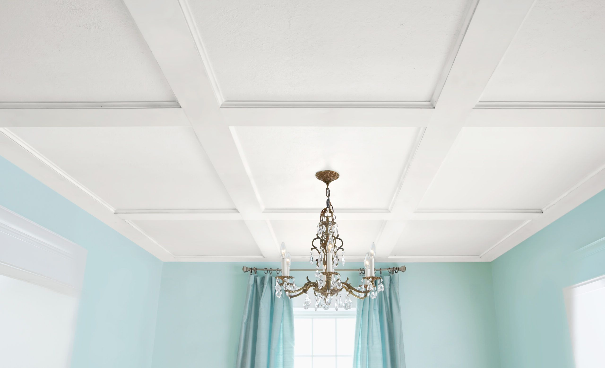
DIY Coffer Ceiling: Step-by-Step Guide To Creating A Stunning Coffered Ceiling
Introduction Are you looking to add a touch of elegance and sophistication to your home? A DIY coffered ceiling could be just the project for you. This classic architectural feature can transform any room into a stunning space with its intricate grid pattern and depth. In this step-by-step guide, we...
Read More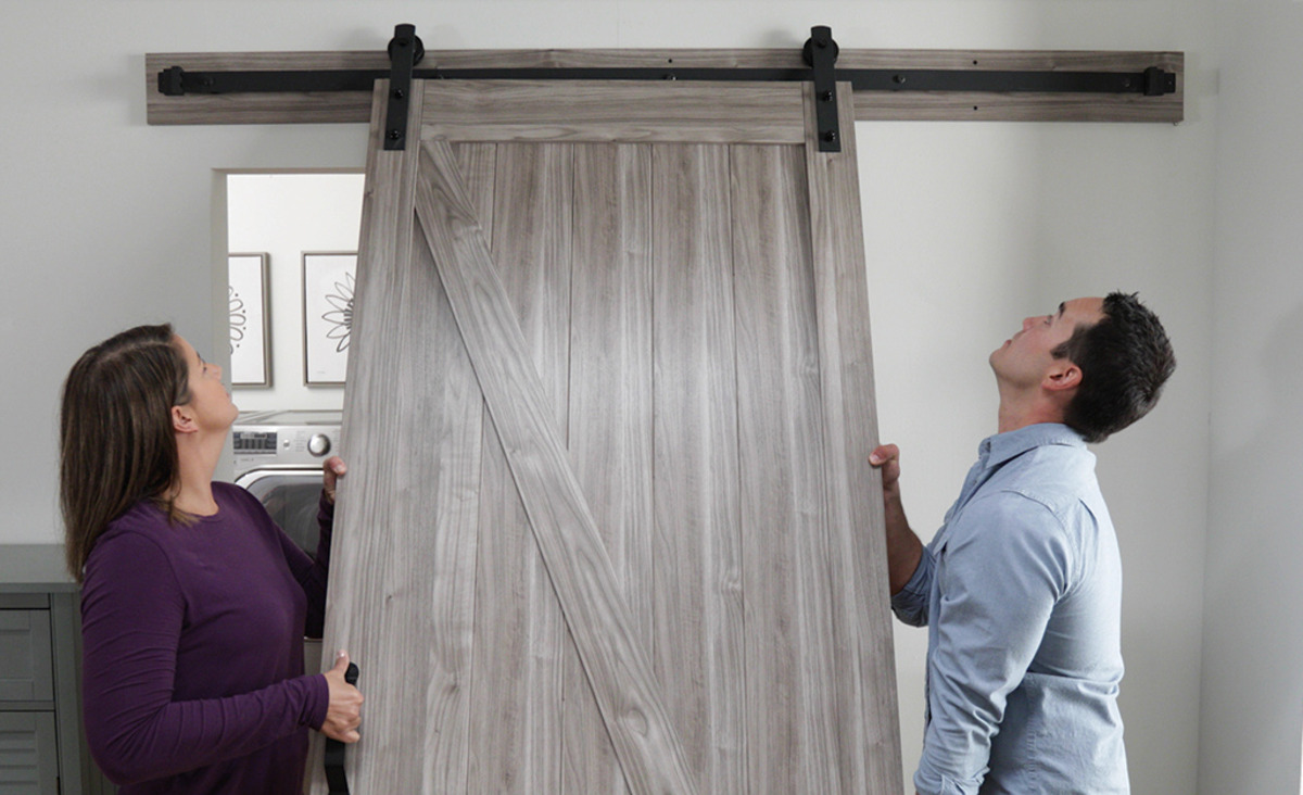
By: Harper Martinez • DIY & Crafts
Hinged Barn Door Plans: Step-by-Step Guide For DIY Enthusiasts
Introduction Are you looking to add a touch of rustic charm to your home? Building a hinged barn door can be a rewarding and practical DIY project. Whether you're aiming to create a stylish room divider or a space-saving entryway, a hinged barn door can add character and functionality to...
Read More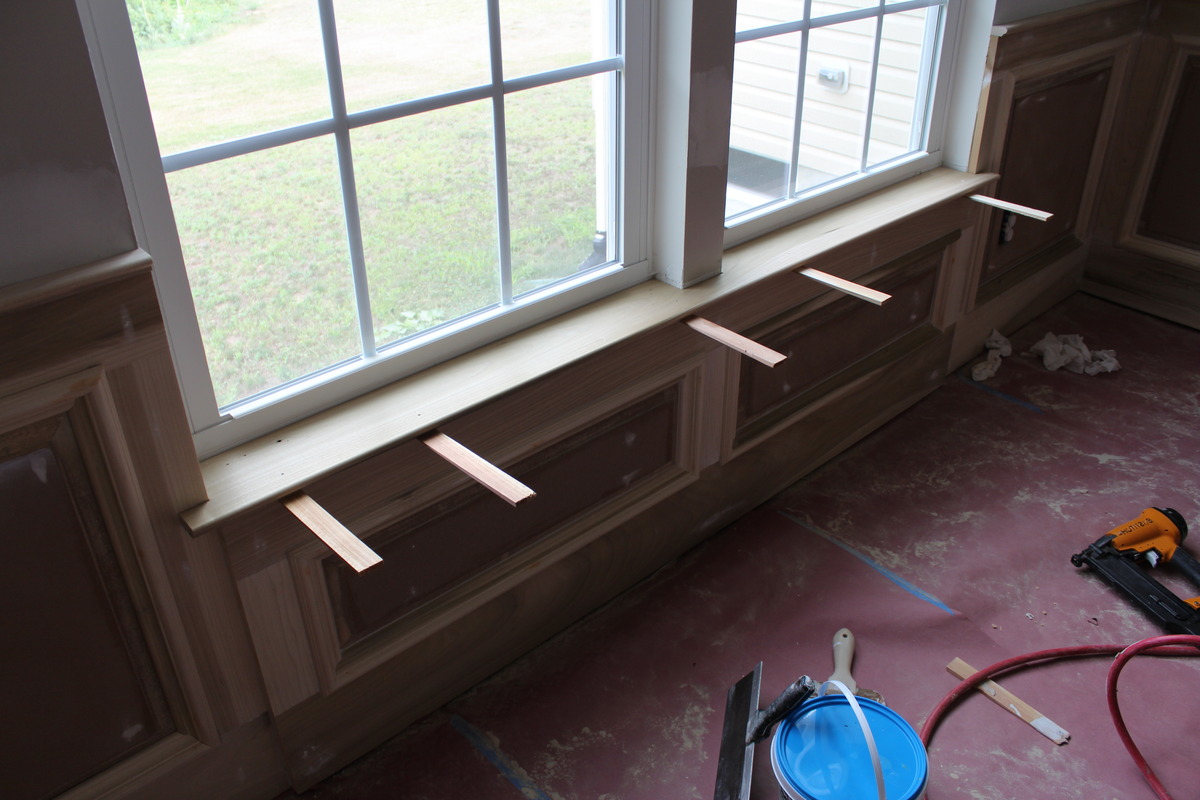
By: Harper Martinez • DIY & Crafts
Introduction So, you've decided to spruce up your windows by adding a window sill. A window sill not only adds a decorative touch to your windows but also provides a functional surface for placing plants, ornaments, or simply enjoying the view. In this guide, we'll walk you through the step-by-step...
Read More
By: Harper Martinez • DIY & Crafts
Cost To Build: DIY Crafts On A Budget
Introduction Are you looking to spruce up your living space with some DIY crafts but worried about the cost? Fear not! With the right approach and a bit of creativity, you can embark on exciting home improvement projects without breaking the bank. In this article, we'll explore the cost to...
Read More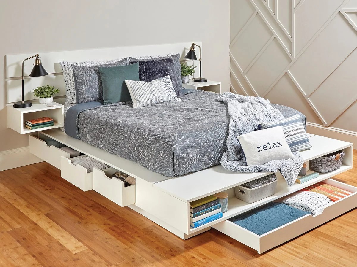
By: Evelyn Wilson • DIY & Crafts
Introduction Are you tired of clutter in your bedroom? Do you need more storage space but don't want to sacrifice style? A DIY storage bed frame might just be the solution you're looking for. Not only does it provide a comfortable place to sleep, but it also offers ample space...
Read More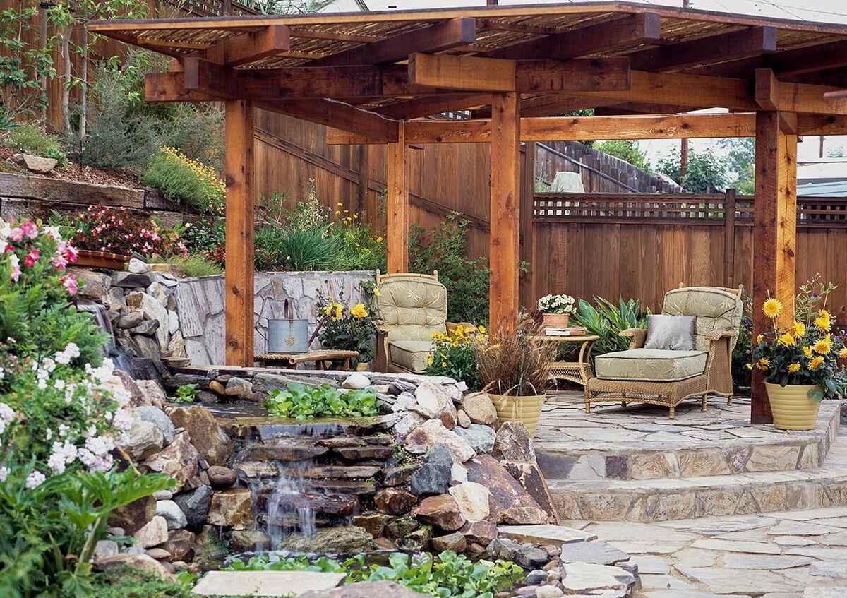
By: Harper Martinez • DIY & Crafts
Introduction So, you've been dreaming of creating a beautiful outdoor space where you can relax, entertain, and enjoy the fresh air. A stone patio might just be the perfect addition to your home. But where do you start? How do you go about building a stone patio that will not...
Read More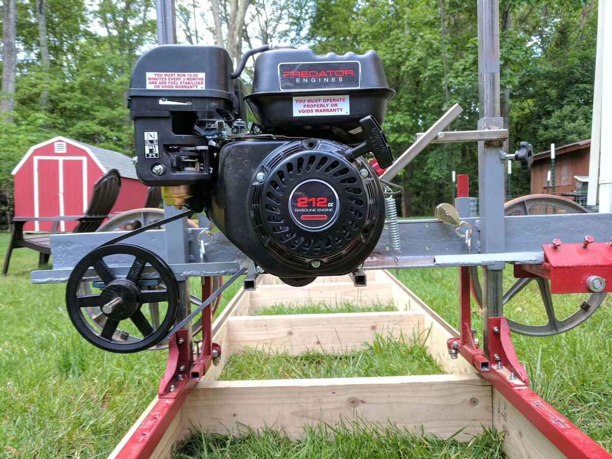
By: Harper Martinez • DIY & Crafts
DIY Sawmill: How To Build Your Own Lumber Mill At Home
Introduction Are you a DIY enthusiast looking to take your woodworking skills to the next level? Have you ever considered building your own lumber mill at home? In this article, we will explore the exciting world of DIY sawmills and guide you through the process of creating your very own...
Read More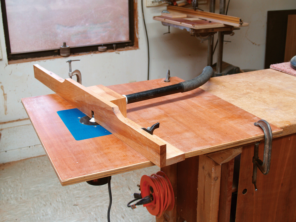
By: Harper Martinez • DIY & Crafts
Introduction So, you've decided to take your woodworking skills to the next level by building your very own router table. Congratulations! A router table is an essential tool for any woodworking enthusiast, as it allows for precise and controlled shaping of wood. Whether you're a seasoned DIYer or just starting...
Read More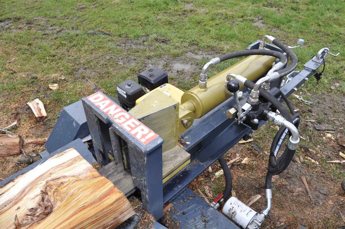
By: Harper Martinez • DIY & Crafts
DIY Homemade Log Splitter: How To Build Your Own Efficient Wood Splitting Machine
Introduction Are you tired of spending hours splitting wood by hand? Do you want to save money by building your own log splitter? In this article, we'll guide you through the process of creating your very own DIY homemade log splitter. Whether you're a seasoned DIY enthusiast or a beginner...
Read More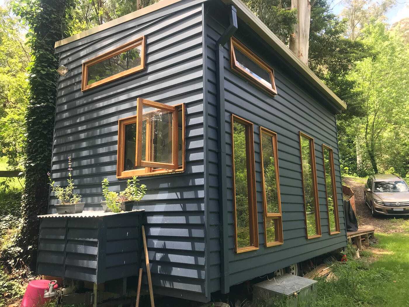
By: Evelyn Wilson • DIY & Crafts
How To Build A Tiny House On Wheels
Introduction So, you've decided to take the plunge and build your very own tiny house on wheels. Congratulations! Building a tiny house on wheels can be an exciting and rewarding project, offering the freedom to live a minimalist lifestyle while still having the flexibility to travel. In this guide, we'll...
Read More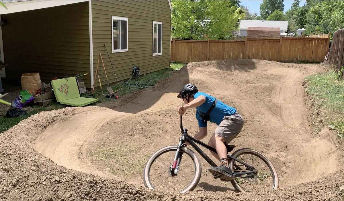
By: Evelyn Wilson • DIY & Crafts
How To Build A Dirt Bike Track
Introduction So, you've got a passion for dirt biking and want to take it to the next level by building your own dirt bike track. Whether you're a seasoned rider or just starting out, having your own track can provide hours of fun and excitement. But where do you start?...
Read More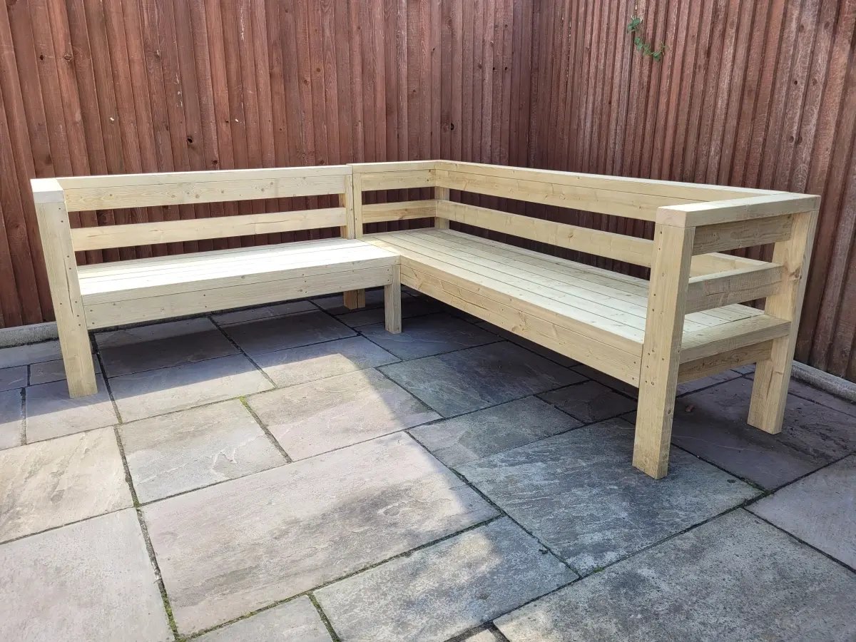
By: Harper Martinez • DIY & Crafts
DIY Outdoor Bench With Back: Step-by-Step Guide
Introduction Are you looking to add some extra seating to your outdoor space? Building your own DIY outdoor bench with back can be a rewarding and cost-effective project. Not only will it provide a comfortable place to sit and enjoy the outdoors, but it can also add a touch of...
Read More
By: Evelyn Wilson • DIY & Crafts
Introduction So, you've decided to take on the exciting project of building a pig pen. Whether you're a seasoned farmer or a first-time pig owner, creating a safe and comfortable space for your pigs is essential. A well-built pig pen not only provides a secure environment for your animals but...
Read More
By: Evelyn Wilson • DIY & Crafts
DIY Futon Frame: How To Build Your Own Comfortable Lounging Space
Introduction Are you looking to add a cozy and versatile seating option to your home? Building your own futon frame can be a rewarding and cost-effective project. Whether you want to create a comfortable lounging space for your living room, guest room, or home office, a DIY futon frame allows...
Read More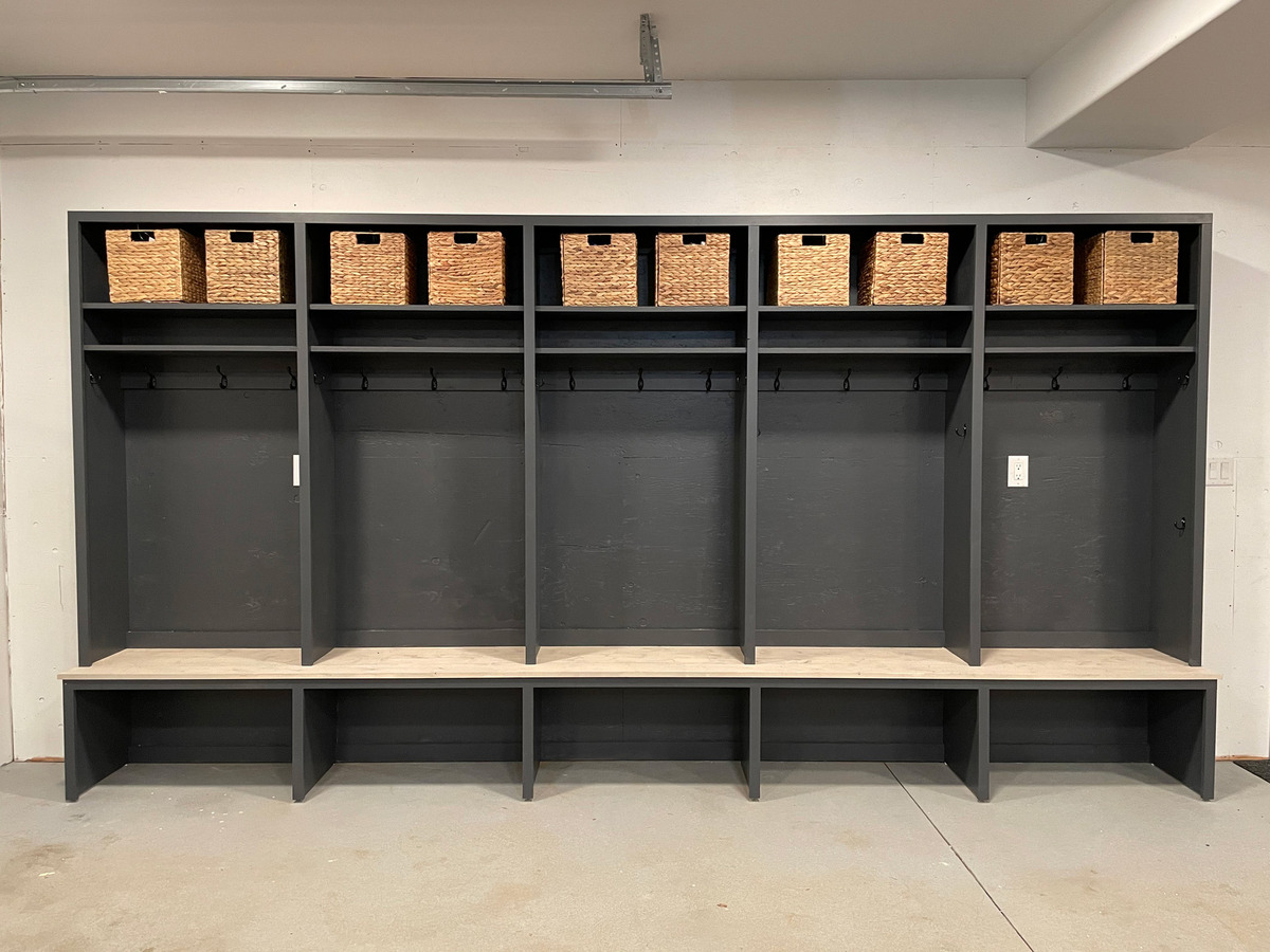
By: Evelyn Wilson • DIY & Crafts
Introduction Are you tired of cluttered entryways and constantly searching for misplaced items? Building a mudroom can be the perfect solution to keep your home organized and tidy. A well-designed mudroom not only provides a designated space for storing coats, shoes, and other outdoor gear but also adds value to...
Read More
By: Harper Martinez • DIY & Crafts
Introduction So, you've decided to take on the challenge of building a dome house. Congratulations! Dome houses are not only unique and eye-catching, but they also offer a range of benefits, including energy efficiency, durability, and resistance to natural disasters. Whether you're looking to create a cozy retreat in the...
Read More
By: Evelyn Wilson • DIY & Crafts
Introduction So, you've always wanted to build your own canoe, huh? Well, you've come to the right place! Building your own canoe can be a rewarding and fulfilling experience. Not only will you have a unique and personalized watercraft, but you'll also gain a sense of accomplishment from creating something...
Read More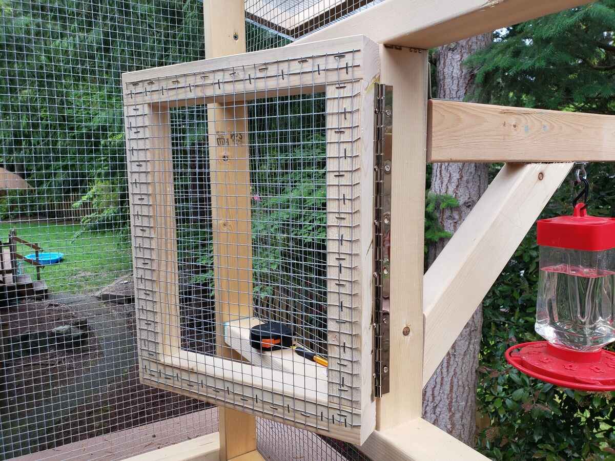
By: Harper Martinez • DIY & Crafts
Introduction So, you've decided to build an aviary? That's fantastic! Whether you're a bird enthusiast or simply want to create a beautiful outdoor space for your feathered friends, building an aviary can be a rewarding and enjoyable DIY project. In this guide, we'll walk you through the steps to create...
Read More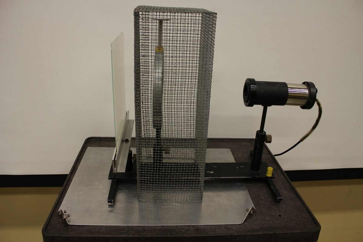
By: Evelyn Wilson • DIY & Crafts
Introduction So, you've heard about Faraday cages and you're wondering how to make one, huh? Well, you've come to the right place! In this article, we're going to dive into the world of Faraday cages and show you how to make your very own. Whether you're looking to protect your...
Read More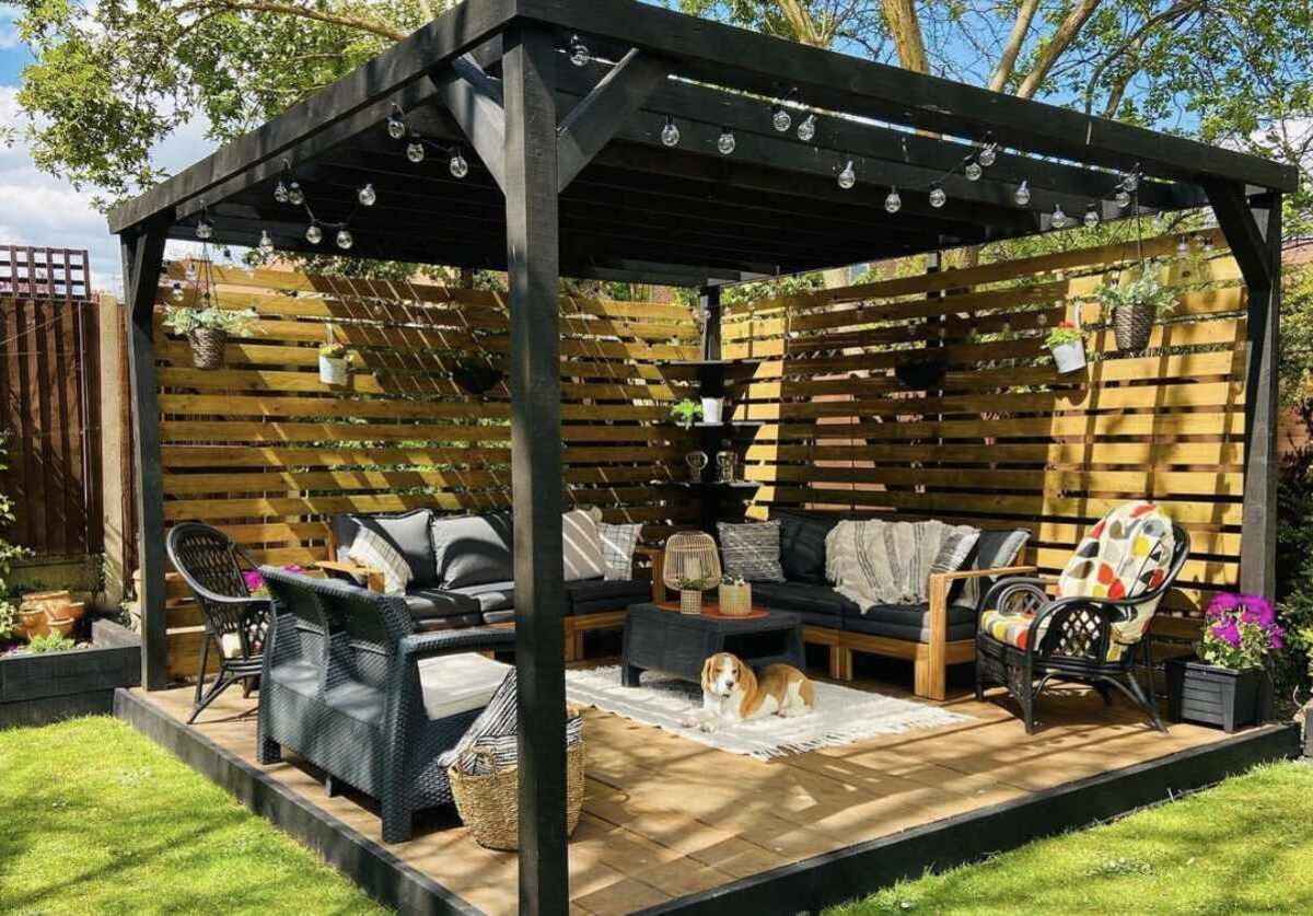
By: Evelyn Wilson • DIY & Crafts
DIY Pergola: How To Build An Attached Structure To Your House
Introduction So, you've been dreaming of a cozy outdoor space where you can relax, entertain, and enjoy the fresh air. A DIY pergola attached to your house might just be the perfect addition to your home. Not only does it provide a shaded area for outdoor activities, but it also...
Read More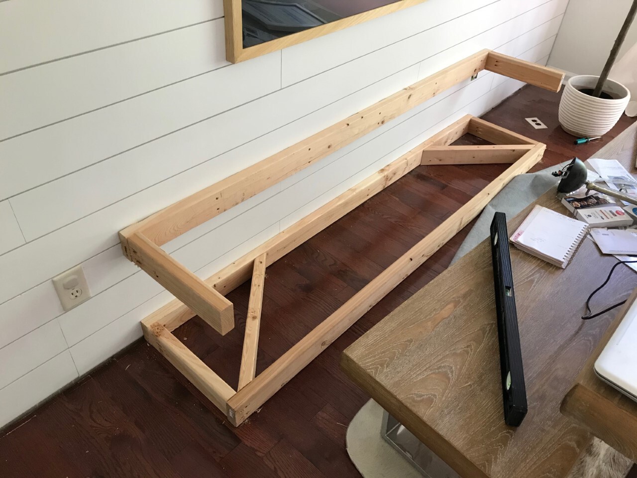
By: Harper Martinez • DIY & Crafts
Built-In Bench: A DIY Guide To Creating A Stylish And Functional Seating Solution
Introduction Are you looking to add both style and functionality to your home? A built-in bench could be the perfect solution for you. Whether you want to create a cozy seating area in your kitchen, a comfortable reading nook in your living room, or a practical storage bench in your...
Read MoreFeatured
By: Harper Martinez • Featured
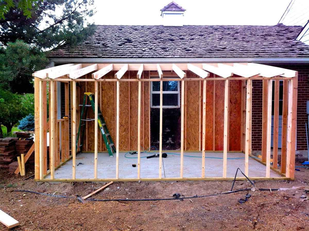
DIY Shed Roof Framing: Step-by-Step Guide For Building A Sturdy Structure
Read More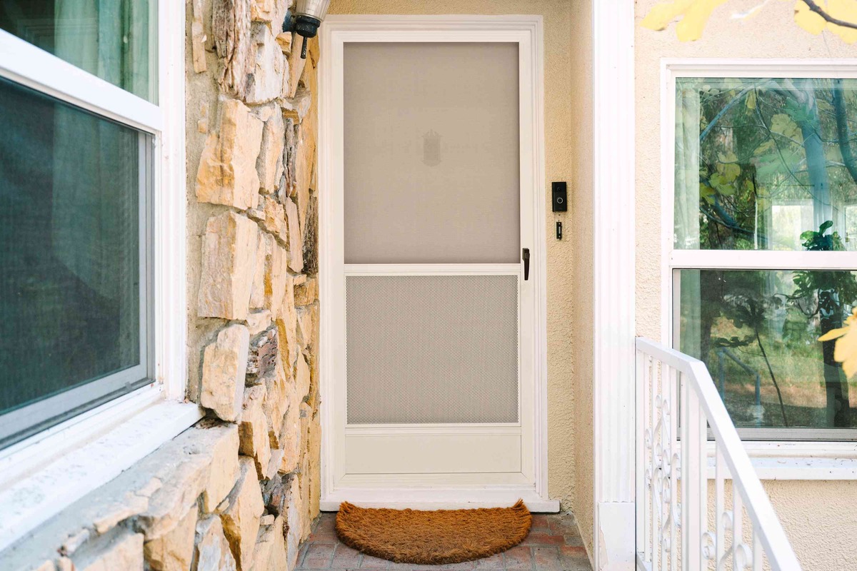
By: Evelyn Wilson • Doors & Windows
DIY Screen Door: Step-by-Step Guide To Building Your Own
Read More
PLEATED LAMPSHADE ARE MY NEW FAVORITE THING
SHOULD WE STAY LIGHT OR GO DARK WITH PAINTING OUR TINY MASTER BEDROOM?