
Home> Create & Decorate > DIY & Crafts
DIY & Crafts
Unleash your creativity with DIY & Crafts, offering a treasure trove of craft projects and DIY ideas for all skill levels, from beginners to seasoned crafters.
By: Evelyn Wilson • DIY & Crafts
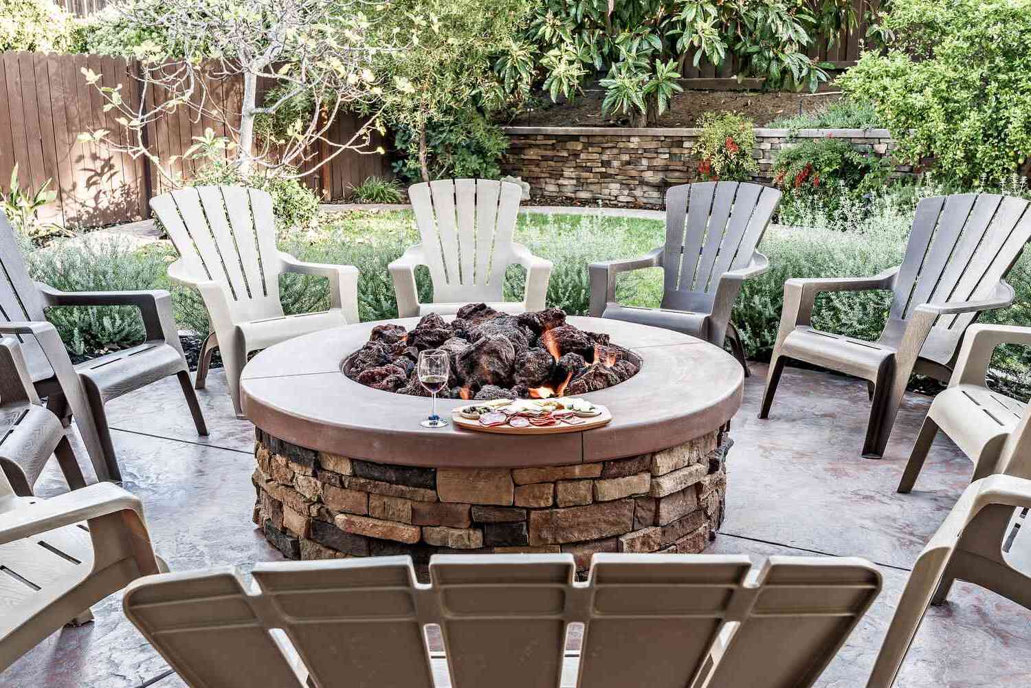
Stone Fire Pit DIY: Create Your Own Backyard Oasis
Introduction So, you're dreaming of cozy evenings spent under the stars, gathered around a crackling fire with friends and family. Well, you're in luck because creating your own stone fire pit is easier than you might think. With a little bit of elbow grease and some creativity, you can transform...
Read More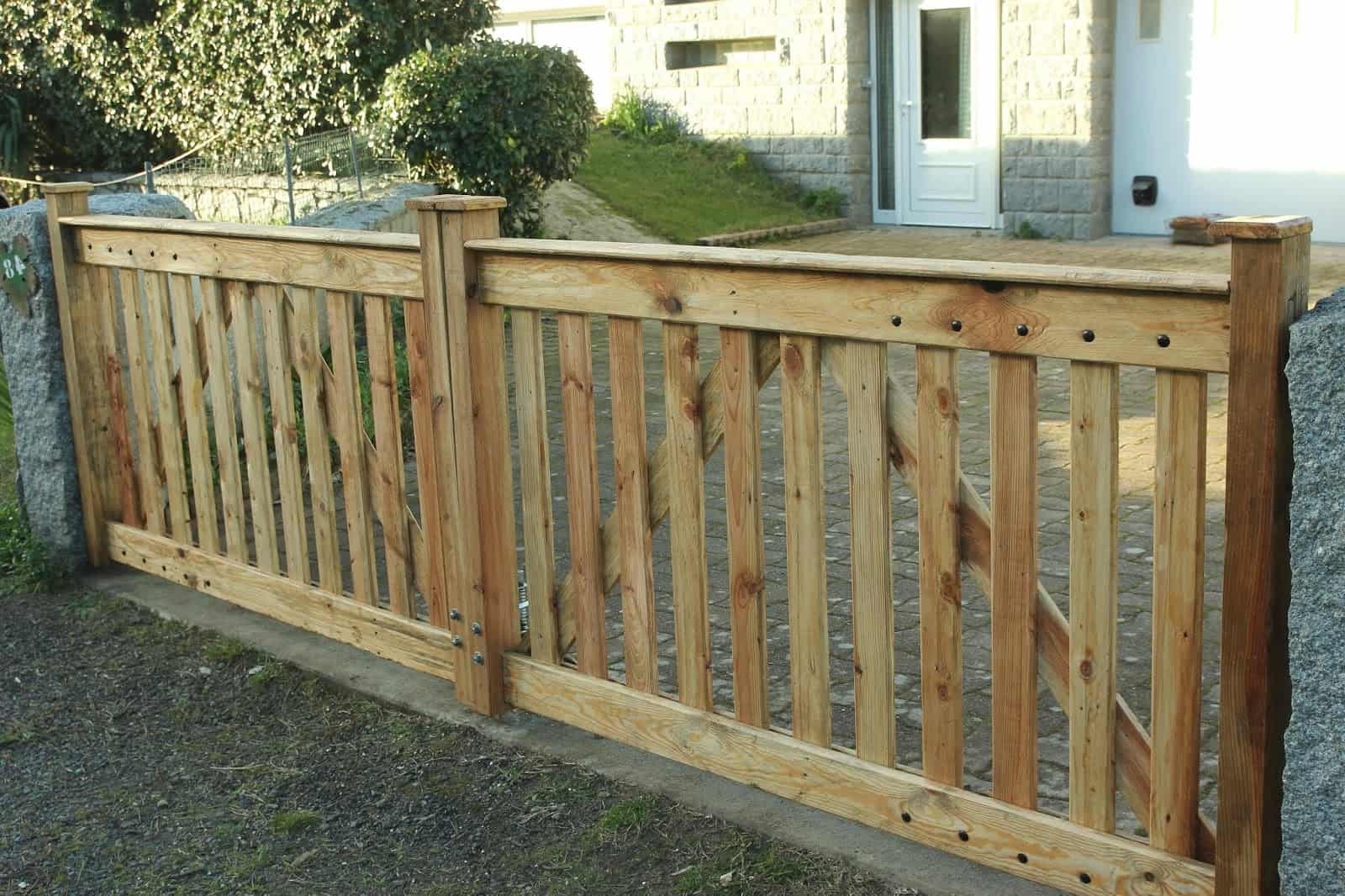
By: Evelyn Wilson • DIY & Crafts
DIY Driveway Gate: Step-by-Step Guide To Building Your Own
Introduction Are you looking to add some extra security and curb appeal to your property? Building your own DIY driveway gate can be a rewarding project that not only enhances the look of your home but also provides an added layer of security. Whether you're a seasoned DIY enthusiast or...
Read More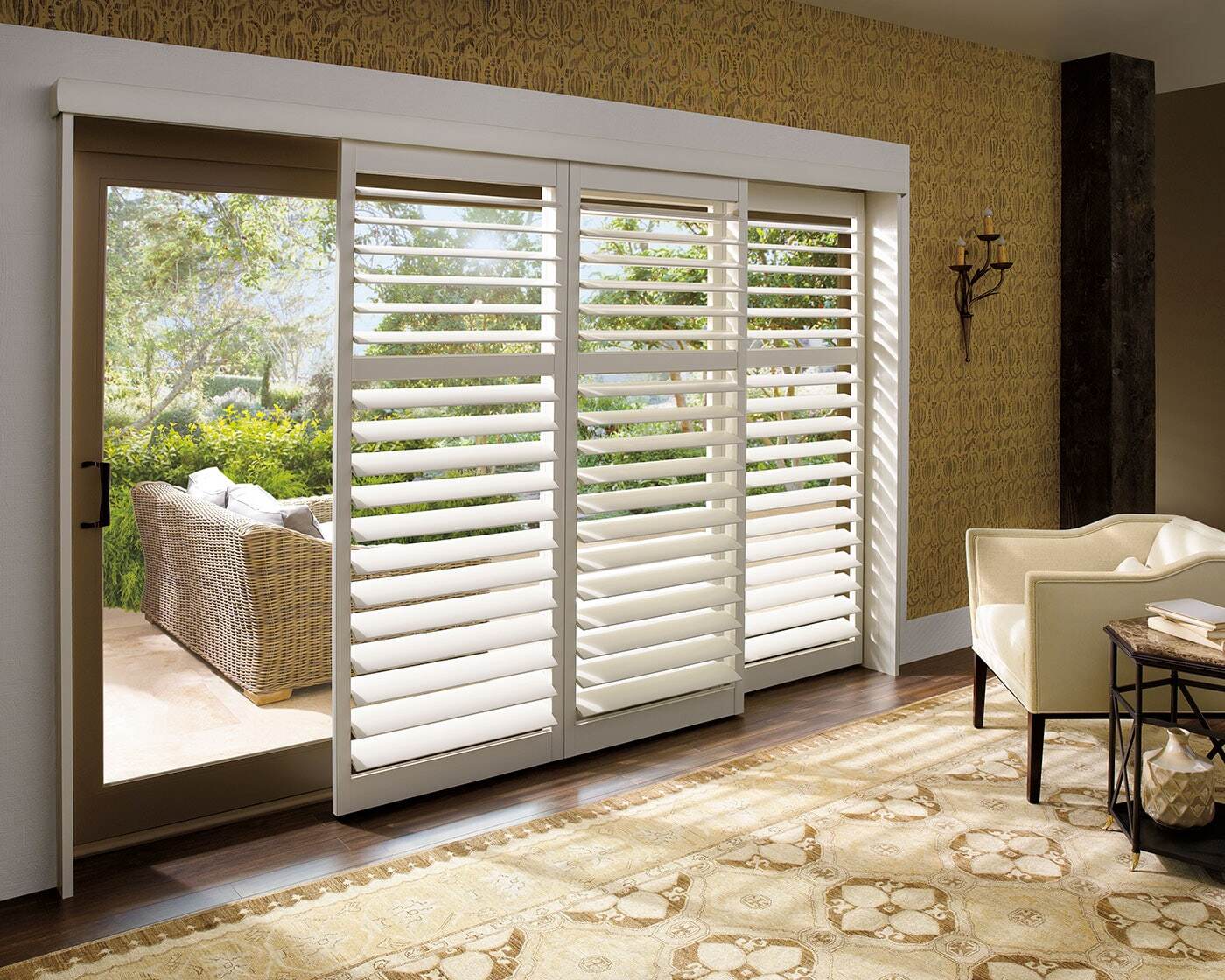
By: Harper Martinez • DIY & Crafts
How To Make Plantation Shutters
Introduction So, you've been thinking about upgrading your windows and adding a touch of elegance to your home. Plantation shutters are a timeless and stylish choice that can enhance the aesthetic appeal of any room. Not only do they provide privacy and control over natural light, but they also add...
Read More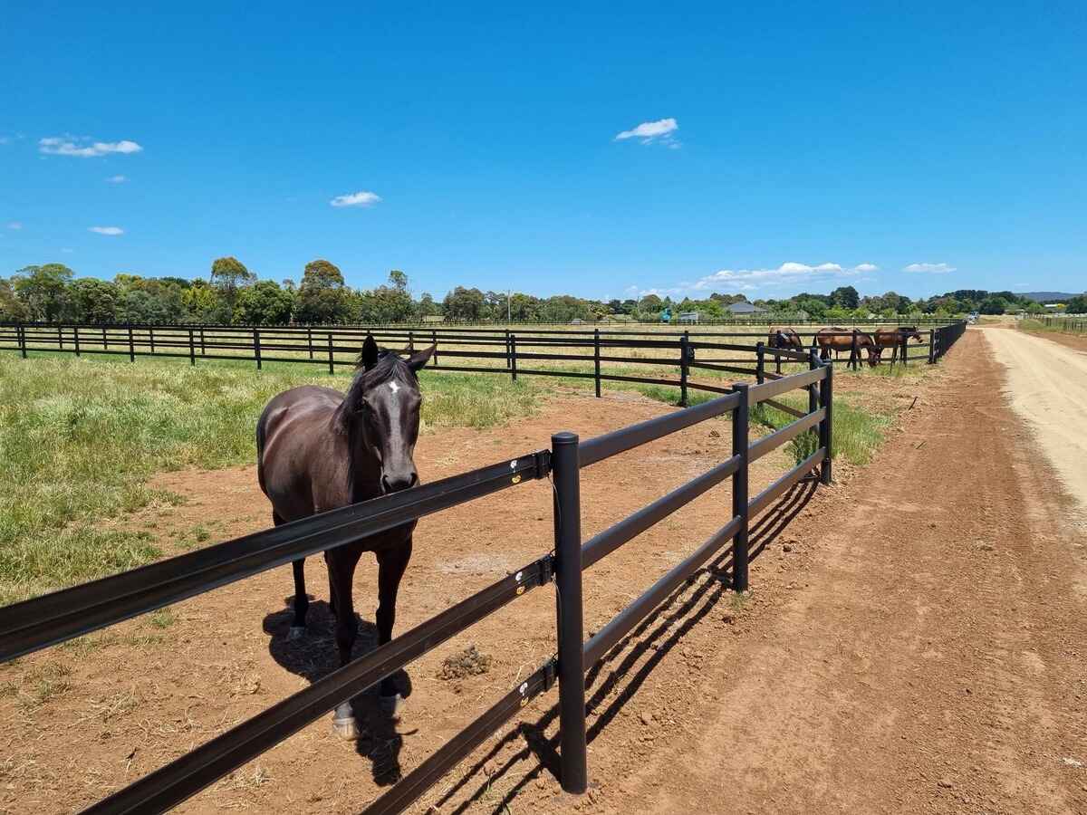
By: Evelyn Wilson • DIY & Crafts
Introduction So, you've decided to build a horse fence. Whether you're a seasoned equestrian or a first-time horse owner, building a horse fence is an essential part of keeping your horses safe and secure. A well-built fence not only provides a boundary for your property but also ensures the safety...
Read More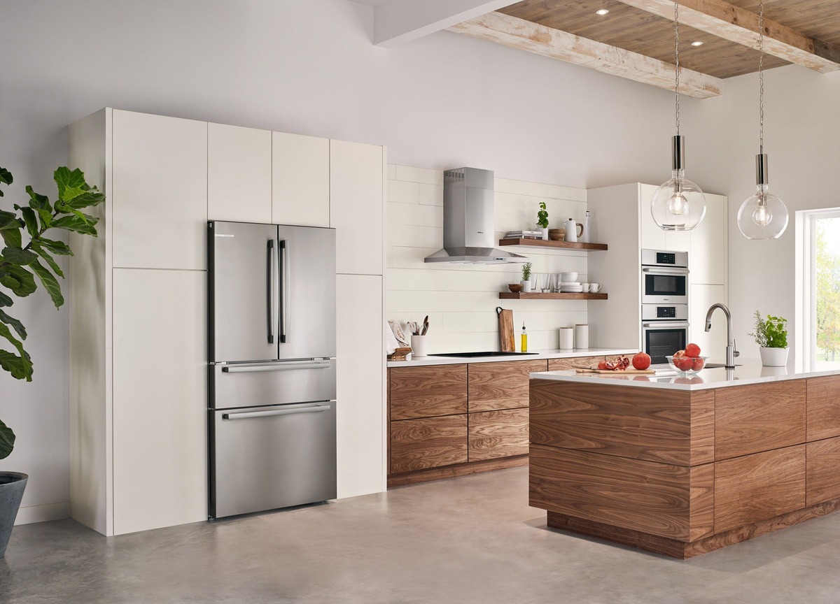
By: Harper Martinez • DIY & Crafts
How To Build A Refrigerator Cabinet
Introduction So, you've decided to take on the challenge of building a refrigerator cabinet. Congratulations! This project will not only enhance the aesthetics of your kitchen but also provide a custom storage solution for your refrigerator. Building a refrigerator cabinet can be a rewarding DIY project that adds both functionality...
Read More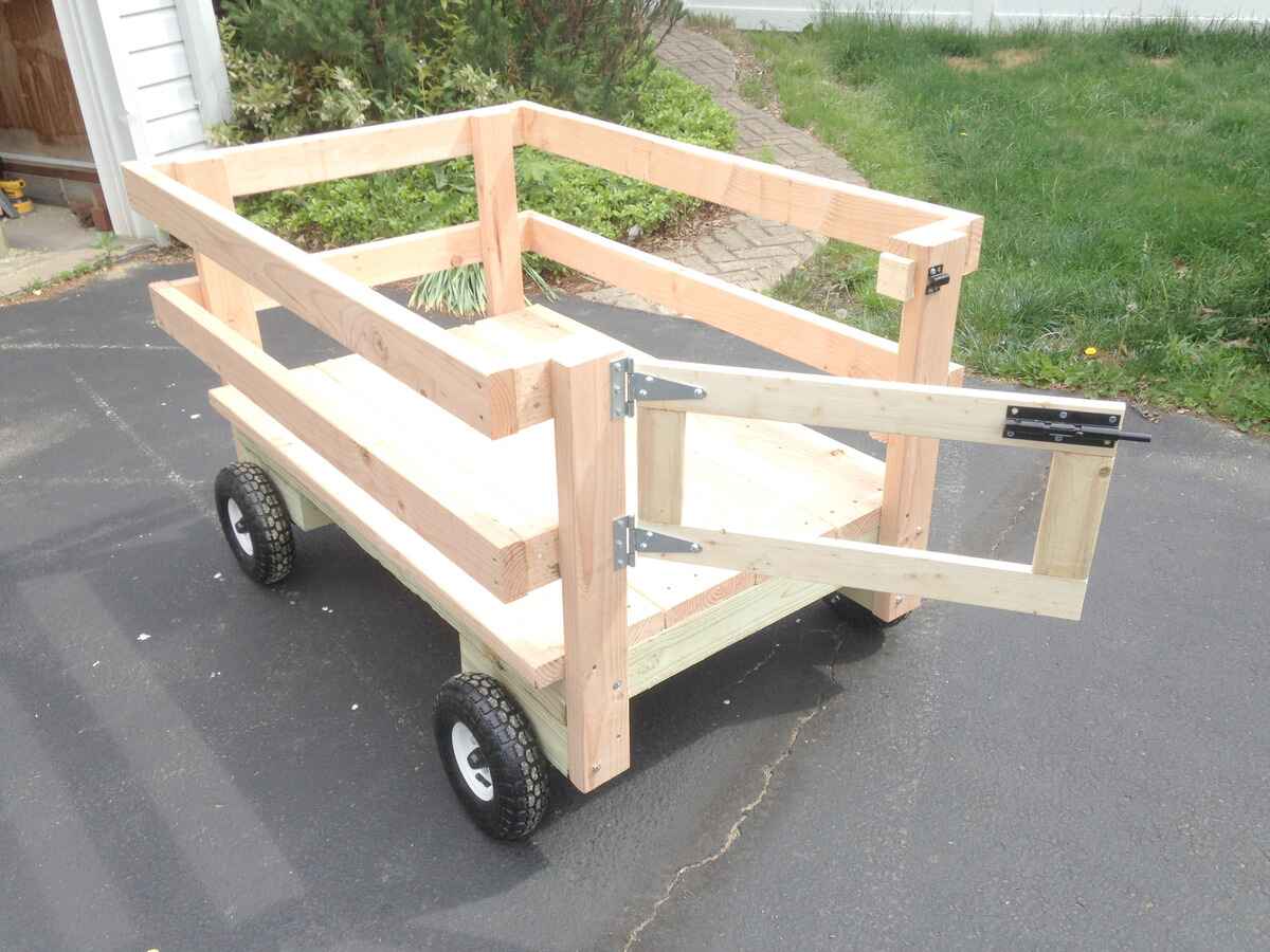
By: Harper Martinez • DIY & Crafts
DIY Wagon: How To Build Your Own Customized Cart
Introduction So, you're looking to build your very own DIY wagon. Whether it's for hauling gardening supplies, giving your kids a fun ride, or just adding a unique touch to your home, a customized cart can be a great addition to your DIY projects. But where do you start? How...
Read More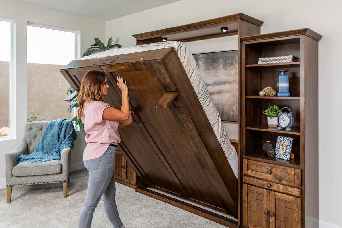
By: Harper Martinez • DIY & Crafts
How To Build A Murphy Bed Without A Kit
Introduction So, you want to create more space in your home without sacrificing comfort? Building a Murphy bed without a kit is a fantastic way to achieve this! Whether you have a small apartment, a guest room, or a home office, a Murphy bed can be the perfect solution to...
Read More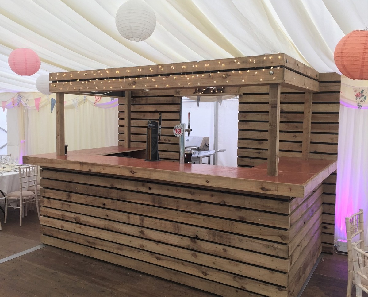
By: Evelyn Wilson • DIY & Crafts
How To Make A Bar Out Of Pallets
Introduction So, you've got a few spare pallets lying around and you're wondering what to do with them. How about turning them into a cool and trendy bar for your home? Making a bar out of pallets is a fun and creative project that can add a unique touch to...
Read More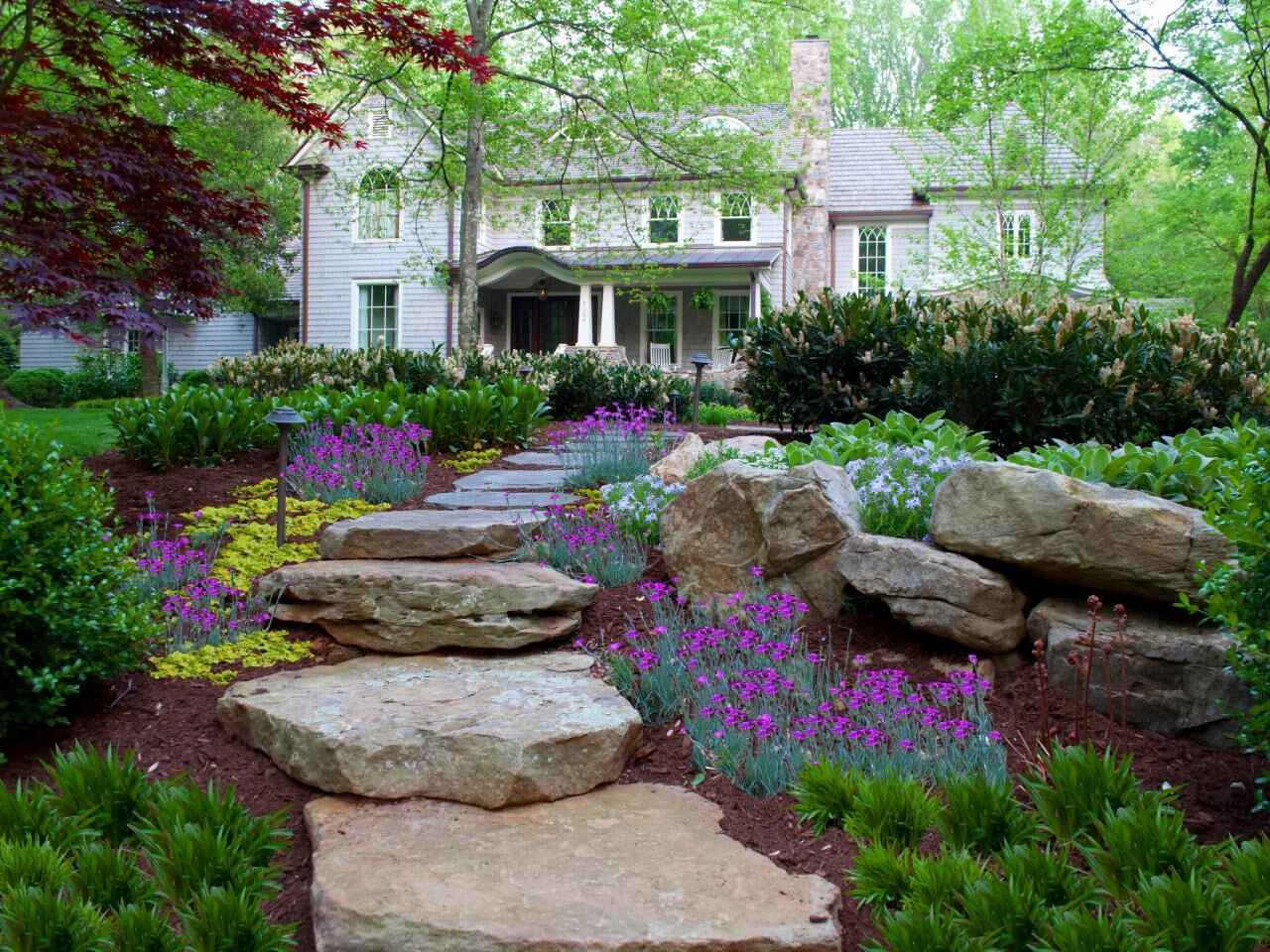
By: Evelyn Wilson • DIY & Crafts
Slope Pavers: A DIY Guide For Crafting A Beautiful Landscape
Introduction Are you looking to enhance the aesthetics of your outdoor space? Slope pavers are a fantastic way to add charm and functionality to your landscape. Whether you want to create a winding pathway or a terraced garden, crafting a beautiful landscape with slope pavers can transform your yard into...
Read More
By: Harper Martinez • DIY & Crafts
DIY Water Fountain: Create A Relaxing Oasis In Your Backyard
Introduction Are you looking to transform your backyard into a tranquil retreat? A DIY water fountain might be just the project you need. Not only does a water fountain add a touch of elegance to your outdoor space, but the sound of flowing water can also create a soothing ambiance....
Read More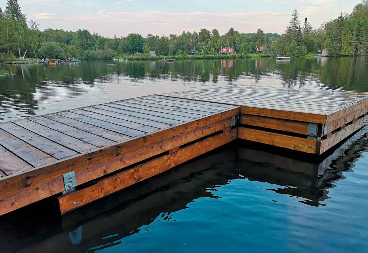
By: Harper Martinez • DIY & Crafts
Introduction So, you've got a picturesque waterfront property and you're dreaming of building a floating dock to make the most of it. Whether you want to create a spot for fishing, sunbathing, or docking your boat, a floating dock can be a fantastic addition to your waterfront oasis. But where...
Read More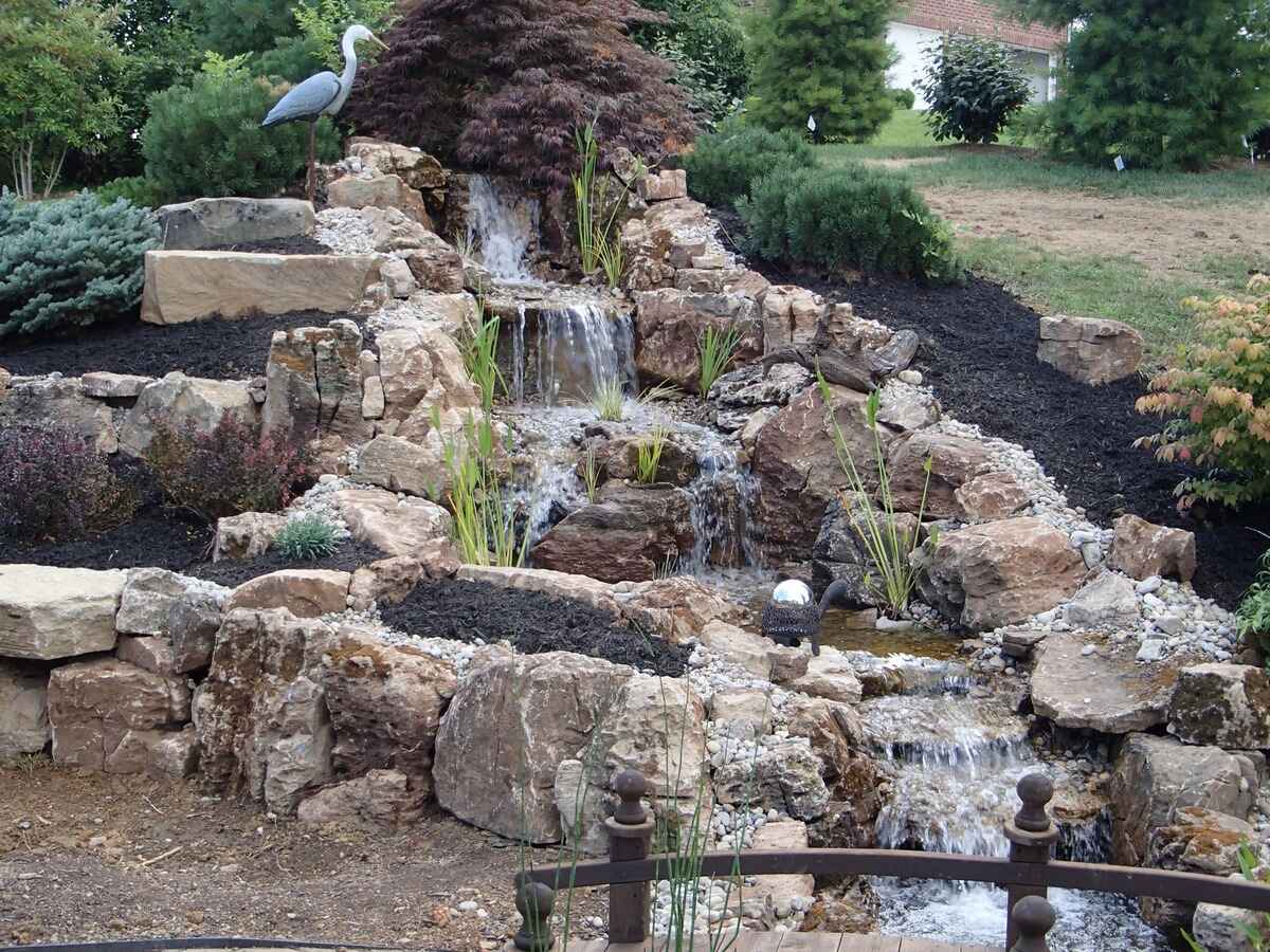
By: Evelyn Wilson • DIY & Crafts
Pondless Waterfall: A DIY Guide To Creating A Serene Oasis In Your Backyard
Introduction Are you looking to add a touch of tranquility and beauty to your backyard? A pondless waterfall might just be the perfect addition to create a serene oasis right in your own outdoor space. In this DIY guide, we will walk you through the steps to create your very...
Read More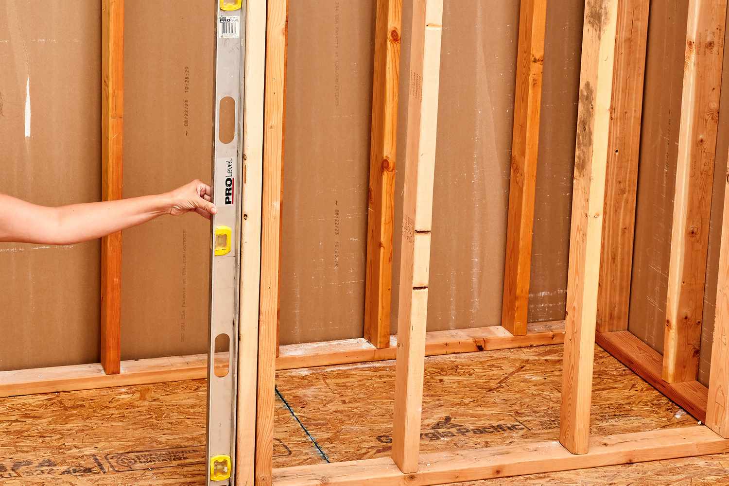
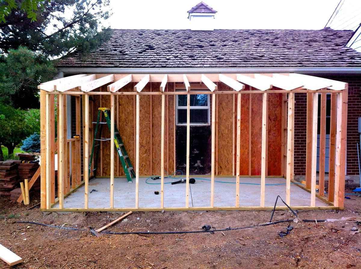
By: Harper Martinez • DIY & Crafts
Introduction So, you're ready to take on a new DIY project and you've decided to frame a wall. Whether you're creating a new room, dividing a space, or simply adding some structure to your home, framing a wall is a fundamental skill for any DIY enthusiast. In this article, we'll...
Read More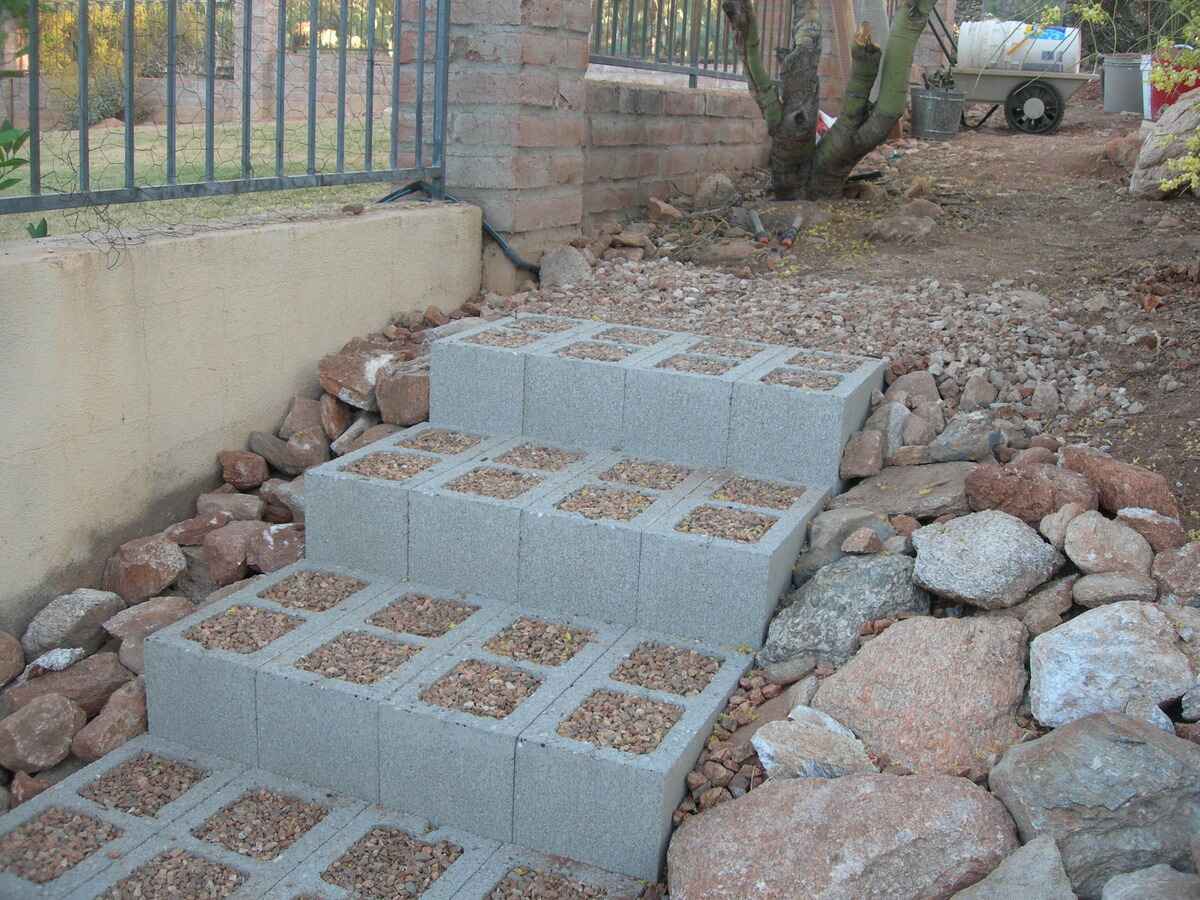
By: Evelyn Wilson • DIY & Crafts
How To Build Steps With Blocks
Introduction So, you've decided to spruce up your outdoor space and add some stylish steps using blocks. Building steps with blocks can be a fantastic DIY project that not only enhances the aesthetic appeal of your home but also adds functionality. Whether you're looking to create a grand entrance to...
Read More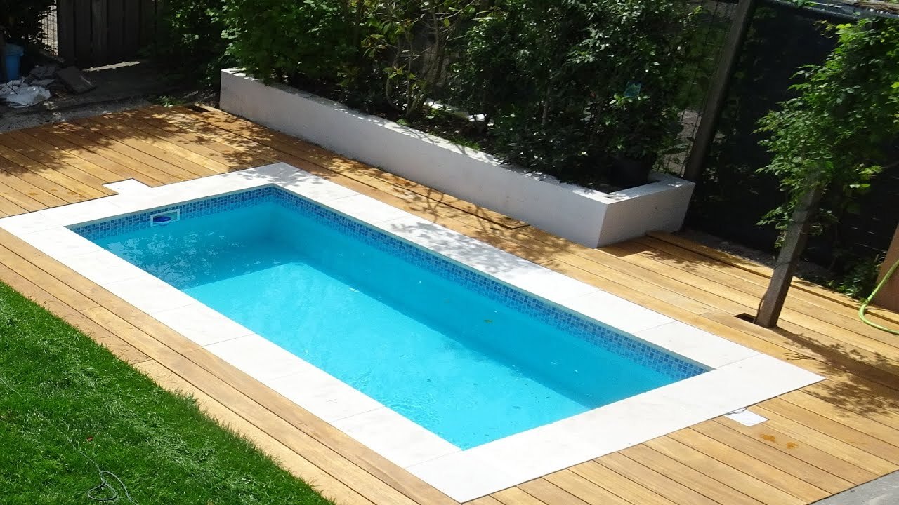
By: Harper Martinez • DIY & Crafts
Introduction So, you've decided to take the plunge and build your own pool. Congratulations! Building a pool can be a rewarding and exciting project that adds value and enjoyment to your home. However, it's important to approach this endeavor with careful planning and consideration. In this guide, we'll walk you...
Read More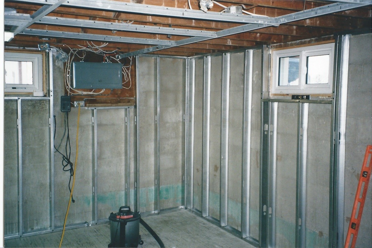
By: Harper Martinez • DIY & Crafts
How To Build A Metal Stud Wall
Introduction So, you're looking to add a new wall to your home or workspace, and you've decided to go with a metal stud wall. Building a metal stud wall is a great choice for its durability, fire resistance, and ease of installation. In this article, I'll guide you through the...
Read More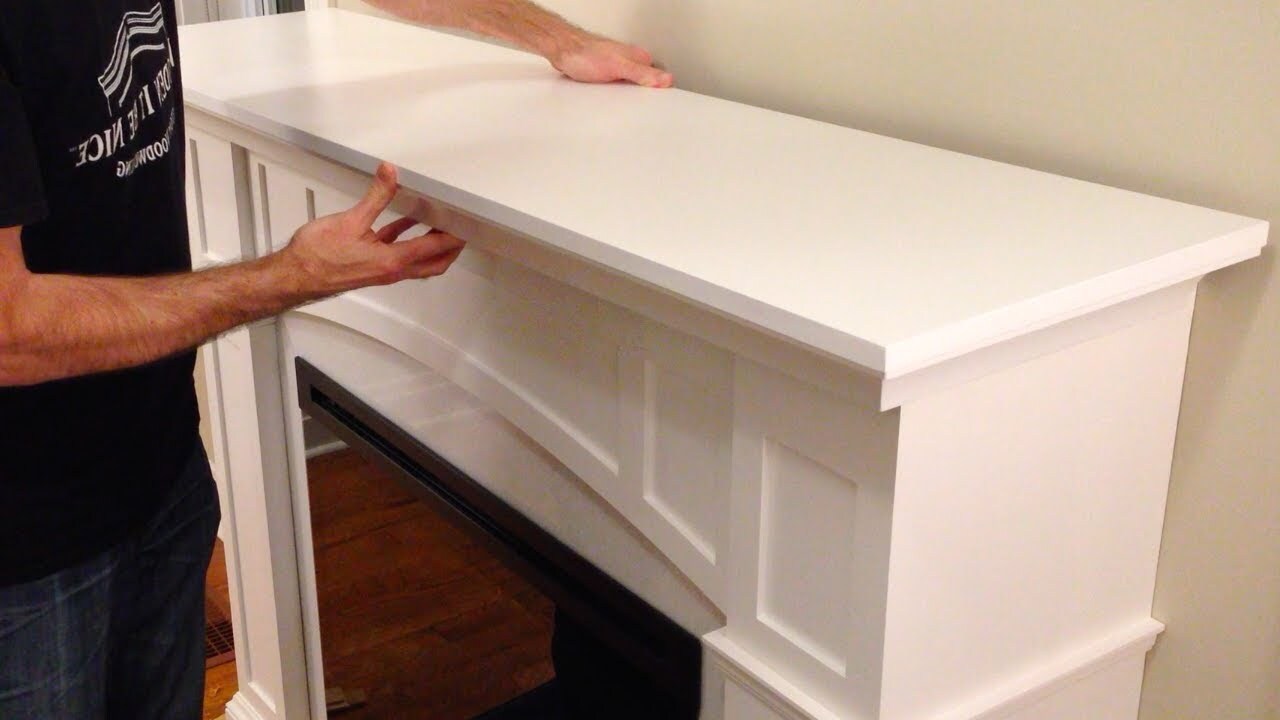
By: Evelyn Wilson • DIY & Crafts
Introduction So, you've got a fireplace that's just begging for a little extra pizzazz, huh? Well, building a mantel is a fantastic way to add some charm and character to your living space. Whether you're a seasoned DIY enthusiast or a newbie looking to tackle your first big project, creating...
Read More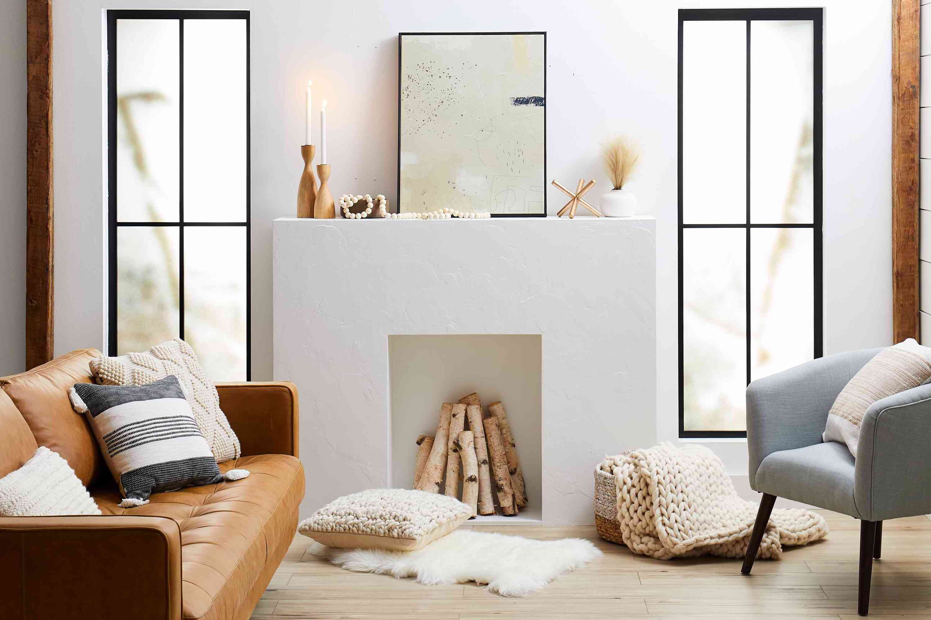
By: Harper Martinez • DIY & Crafts
Introduction So, you've decided to add a cozy and inviting hearth to your home. Whether you're looking to create a warm gathering place for family and friends or simply want to enhance the aesthetic appeal of your living space, building a hearth can be a rewarding and fulfilling DIY project....
Read More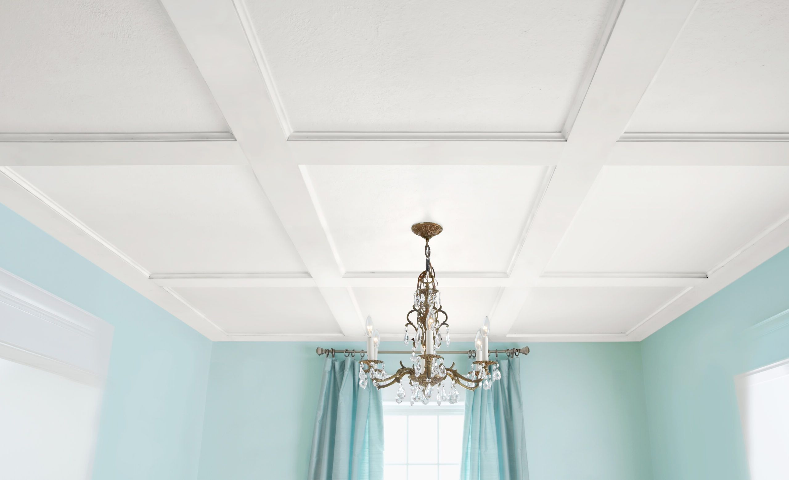
By: Harper Martinez • DIY & Crafts
DIY Coffer Ceiling: Step-by-Step Guide To Creating A Stunning Coffered Ceiling
Introduction Are you looking to add a touch of elegance and sophistication to your home? A DIY coffered ceiling could be just the project for you. This classic architectural feature can transform any room into a stunning space with its intricate grid pattern and depth. In this step-by-step guide, we...
Read More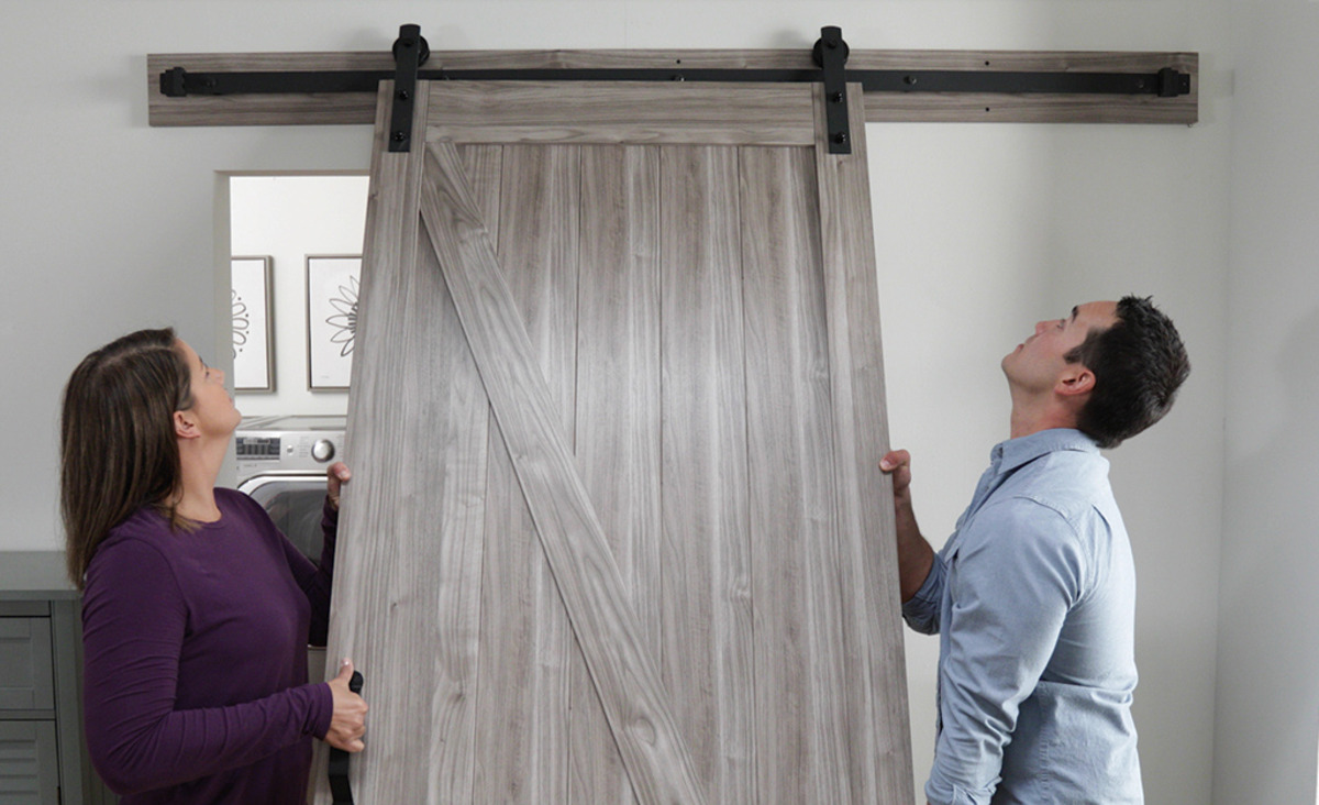
By: Harper Martinez • DIY & Crafts
Hinged Barn Door Plans: Step-by-Step Guide For DIY Enthusiasts
Introduction Are you looking to add a touch of rustic charm to your home? Building a hinged barn door can be a rewarding and practical DIY project. Whether you're aiming to create a stylish room divider or a space-saving entryway, a hinged barn door can add character and functionality to...
Read More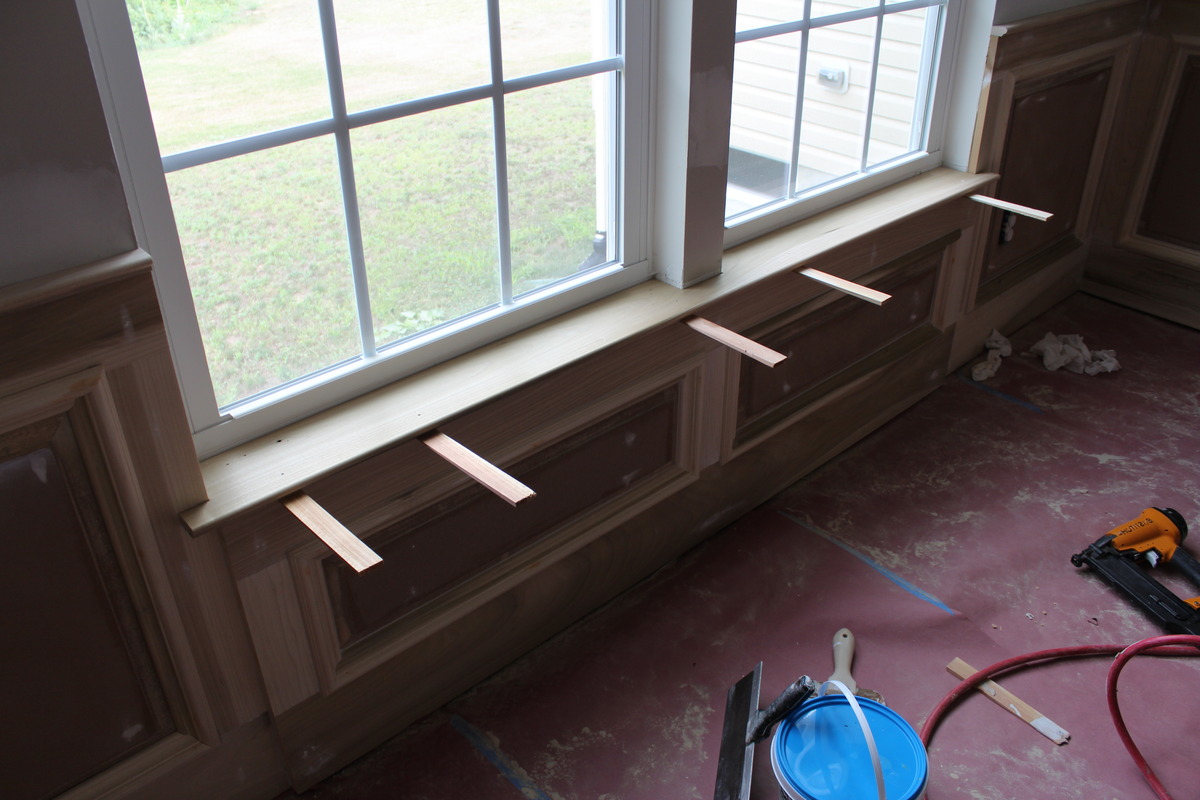
By: Harper Martinez • DIY & Crafts
Introduction So, you've decided to spruce up your windows by adding a window sill. A window sill not only adds a decorative touch to your windows but also provides a functional surface for placing plants, ornaments, or simply enjoying the view. In this guide, we'll walk you through the step-by-step...
Read MoreFeatured
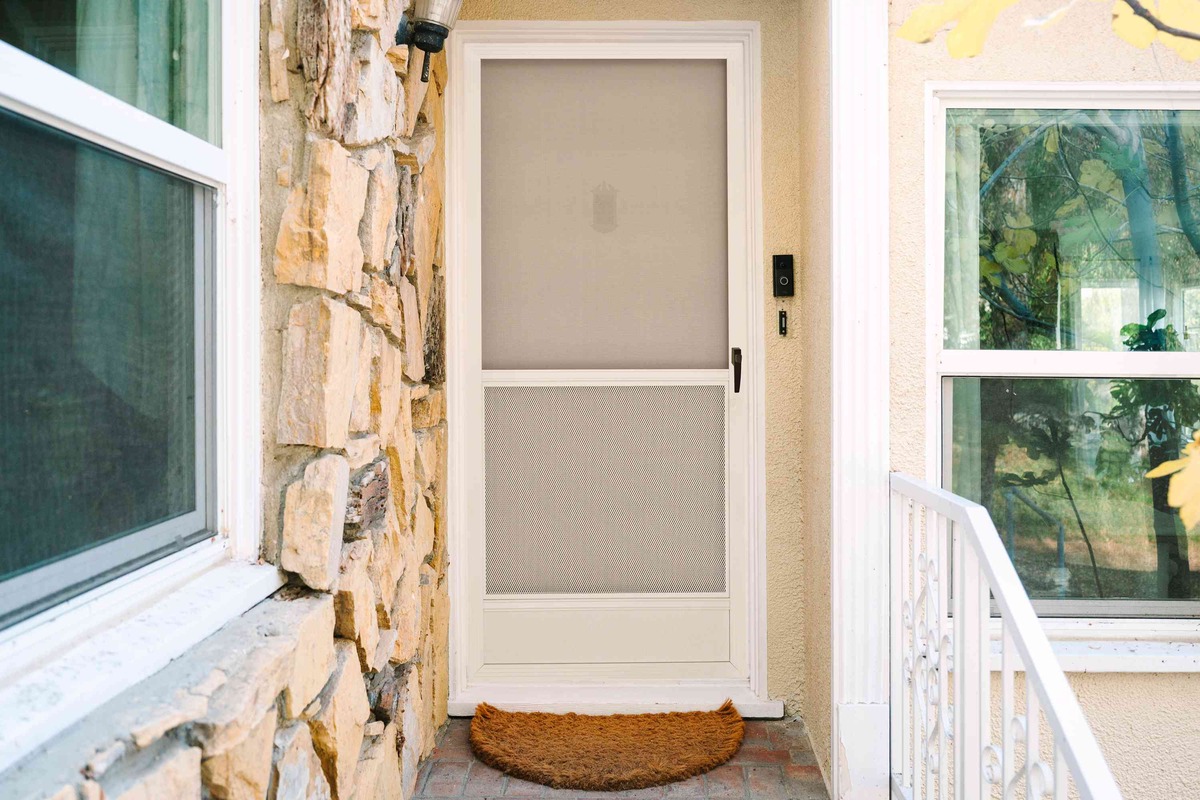
By: Evelyn Wilson • Doors & Windows
DIY Screen Door: Step-by-Step Guide To Building Your Own
Read More
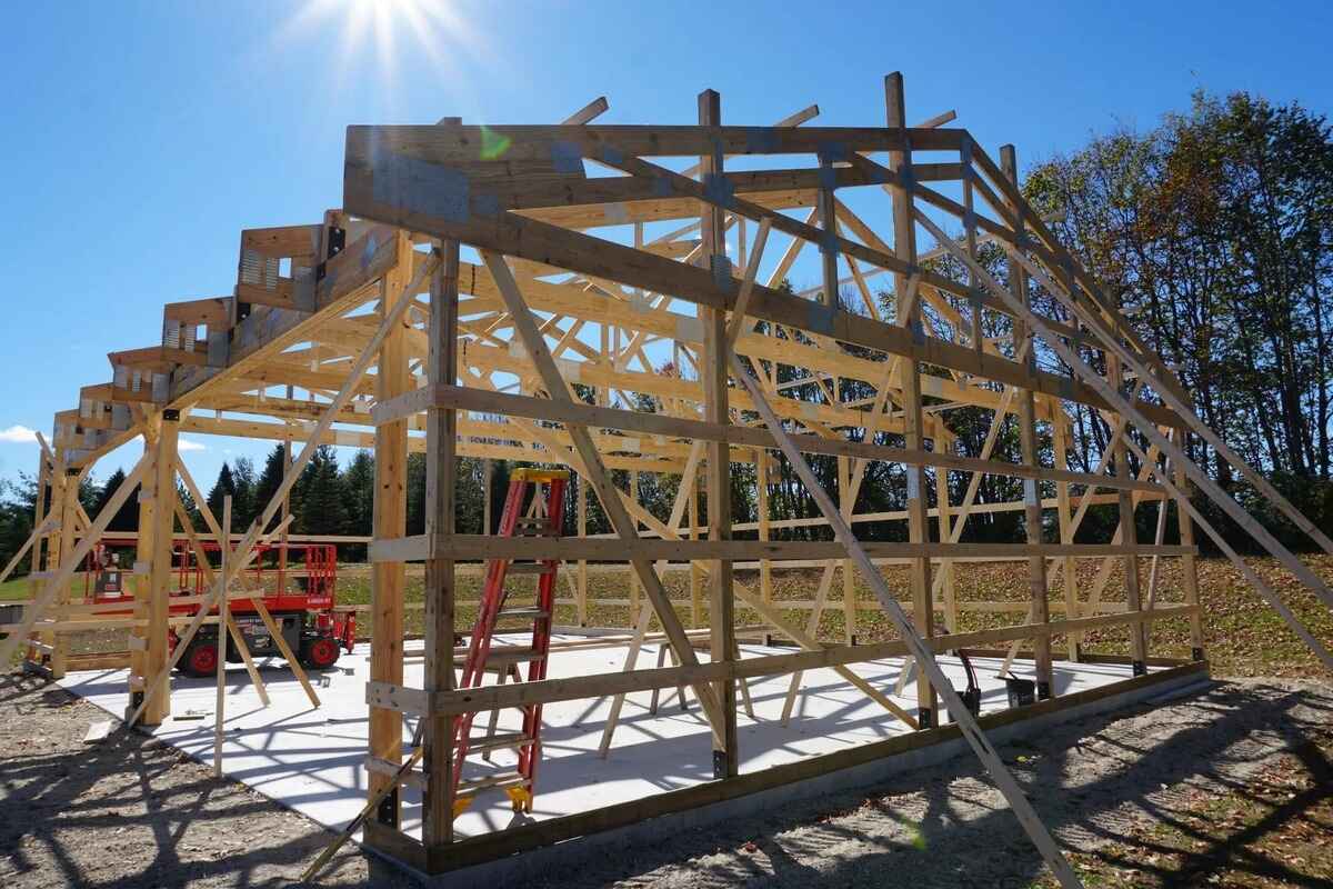
By: Harper Martinez • Featured
DIY Shed Roof Framing: Step-by-Step Guide For Building A Sturdy Structure
Read More
PLEATED LAMPSHADE ARE MY NEW FAVORITE THING
SHOULD WE STAY LIGHT OR GO DARK WITH PAINTING OUR TINY MASTER BEDROOM?